Hello. We like to collect well-designed vintage pottery (and lots of other stuff) from the 1950s,
'60s and '70s. Here are some pictures and info of a selection of the things we've found.

Saturday 30 April 2011

Portmeirion Tivoli Storage jars 1964


It was a sunny day so I took these colourful pots outside into the sunshine to photograph them. I think this printed pattern is fabulous – it's so typical of the design style and the graphics of the the 1960s.

These storage jars are part of a larger range of tableware designed by Susan Williams-Ellis for Portmeirion Pottery, Stoke-on-Trent. They were produced in 1964. The pattern name is Tivoli, apparently inspired by a visit to the Tivoli Gardens in Copenhagen. Up to now, I've only seen these two colour schemes. One scheme is in chocolate brown and turquoise, and one is in olive green and turquoise.

As far as I've been able to discover, this range was only in production for a few years, it wasn't as successful as had been hoped. I can't think why. If it was available in the shops today, I'd buy it.

Tuesday 26 April 2011

Hornsea Edenfield 1964. Those cylinder vases just keep coming.


I mentioned a disproportionate affection with the cylinder vase in my last post. So you can't say that you weren't warned.

Here we have another round, straight-sided beauty. This example is from 1964. The range is Edenfield by Hornsea Pottery. This understated yet elegant design features fine, incised, fluted grooves and pastel coloured bodies. One really nice aspect is the fact that the designer decided to colour the inside of the vases with strong contrasting colours – a nice touch.

Here's the maker's mark.

Monday 25 April 2011

Troika cylinder vase by Linda Hazel.


Photographing this vase recently, made me realise how many vases in the Potshots collection have straight sides. Perhaps it's because to my eye, simple cylinders have a nice solid feel to them.

This particular cylinder-shaped vase is by Troika. It has a nicely painted design that features creamy white circles with thin bands of dark orange and blue. This makes the round shapes look almost like the planet Saturn. Like a lot of Troika pottery, the vase also has a lovely feel with its outer matt finnish and pitted texture.

The base has the monogram LH, indicating that it was painted by Linda Hazel, probably around 1972. I managed to trace the painter's mark through the excellent Digital Museum of Cornish Ceramics

Thursday 21 April 2011

A colourful diversion via the 1960s


Whilst scouring the car boot sales in search of interesting pots for the Potshot collection, I sometimes get a little distracted. I know I should be focusing on my quest for pearls of pottery perfection but occasionally I can't help taking the odd diversion.

Here's one example. I couldn't resist this set of brilliant table place mats. The colours are superb and the stylised flower-power decoration is so funky.  The mats feel as if they're printed on tin and they are cork-backed. I don't know who made them but they are marked Made in England. I imagine they are probably 1960s or early 1970s.

OK, they're not pots but you must agree that for great design, great graphics and great colours we're allowed the odd diversion.

Wednesday 20 April 2011

Soholm Erika vase. Vintage textured stoneware from Denmark


The first thing that strikes you about this pottery is the charm of the warm, earthy colours. But it's when you pick one up and look closely at the surfaces that you see the real beauty lies in the wonderful textures. The base of the vase and the underside of the bowl are left unglazed. The surface of the vase is pitted and pot-marked, and there's a genuine hand-made quality to the object.

This is Erika, a range of handmade stoneware items designed by Poul Brandborg and made at Soholm, Bornholm, Denmark. I would imagine they date from the early 1970s.

As you may have gathered, I'm a big fan of vintage Danish ceramics. If you are too, I posted some more recently here and here

Hornsea Pottery slip-decorated fish dish from the 1950s


Caught one! Still trying to catch the other two.

This small fish dish is from 1956. Made by Hornsea Pottery, it's decorated with a series of dots and trails of liquid slip in black, pale turquoise and pale yellow. It's from a set of three. There's also one with a black background and one with a blue background. I'm still trying to find the other two.

As well as the fish dishes, Hornsea made a whole range of these small slip-decorated dishes in the mid to late 1950s.  They come in a variety of shapes: square, triangular, oval, oblong, some are decorated with a butterfly. I'm not as keen on the black background dishes, I think I prefer those with the pastel coloured backgrounds.

For anyone who would like to see pottery like this in the 'flesh' and is in the area, there's a huge range of Hornsea Pottery on show at the Hornsea Museum 

Sunday 17 April 2011

Retro Denby Langley vases. Is this the hand of Glyn Colledge?


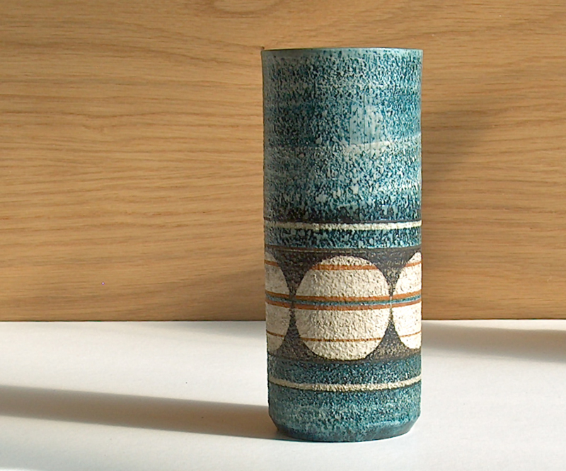
Charity shops, car boot sales and flea markets are great places to find some excellent retro pottery from the 1960s and 1970s. This is a range of pottery that caught my eye a couple of years back and I've been picking it up here and there ever since. The main reason is that I like it.

At this point, I would normally go on to tell you what I've found out about this pottery. On this occasion, I must confess that I don't know a lot about these vases.

I do know they are by Langley Pottery, which was, at the time I think they were made, owned by Denby Pottery. I would guess they were made at the end of the 1960s or the beginning of the 1970s. I also know that Glyn Colledge was busy producing some wonderful work for Denby and Langley around this time. I wondered if this could be a range designed and/or painted by him. Unfortunately, I haven't got a range name either so researching these pots has been unproductive, so far.

The vases are quite heavy, the glaze is silky matt, and the abstract, hand painted decoration in dark greens and oranges looks really stylish. 

If anyone does know any more about this range, I'm always grateful for info.

A bit more here on Glyn Colledge 
 
PS (20th April) Contacted the Langley Pottery Collectors Society (thanks cowcups) and got this reply (thanks Jenifer) "Your vases are from the Sycamore range of vases and bowls. It was designed by Glyn Colledge and was in production at the Langley Mill Pottery from 1963 – 1965"

Ah, the power of the internet.
 

Thursday 14 April 2011

Hornsea Impact. Vases and boxes from 1964, 1965


Hornsea Pottery again, this time from the early 1960s. This is part of a range called Impact. And I think, even today, it would look really good displayed in a modern interior. The circular graphic emblems are raised in relief against the shiny black bodies of the pots. The designs are in blue or pale brown.

Impact was designed by George Ratcliffe and was produced in 1964 and 1965. The vases shown in these pictures have square bodies and round necks – I like the lip at the top of the neck, it seems to just finish the vases off properly. The lidded square box is nice too.

In a way, this is only one half of the Impact range. The other half is made up of a selection of cylindrical shaped vases with grooved bodies. I hope to be showing some of those in a later post.

Monday 11 April 2011

Midwinter Mexicana a real retro colour palette


I know it's only an egg cup. But it's a neat way to show off a nice bit of 1966 colouring.

This little egg cup is from a range of table ware by Midwinter Pottery and is in the pleasing Fine shape. A range which used simple, cylindrical forms with painted or printed decorations. The pattern is Mexicana from 1966 and it was designed by Jessie Tait. I like the combination of colours used in the hand-painted stripes. rust, ochre, olive, grey and black. They seem so typical of the objects, fashions and decorations of the mid-1960s.

More on Jessie Tait

Sunday 10 April 2011

Hornsea Pocket Wall Vase 1955. Shades of Barbara Hepworth.


One of my personal favourites.

This wonderfully shaped pot is by Hornsea Pottery. It was made in 1955 and is described by Hornsea simply as a pocket wall vase. I'm not sure exactly how it was supposed to hang on a wall, its base seems to be designed to stand flat on a surface.

The beauty of this vase, in my opinion, lies in its elegant and sculptural form. The pierced circular holes and asymmetrical shape are so reminiscent of the work of British sculptor Barbara Hepworth.

Even though the vase may have been originally designed to hold a spray of flowers, to me, the object is a pleasure displayed just as it is.

I suspect this vase is quite a rare one. During the time that I've been collecting Hornsea pottery, I've only ever seen one or two examples.

Barbara Hepworth

More on Barbara Hepworth


Barbara Hepworth photo:
Erling Mandelmann / photo©ErlingMandelmann.ch


Inger Waage Stavangerflint Man with Mandolin plate

Produced by Stavangerflint, Norway, this vintage plate features a wonderful stylised illustration by designer Inger Waage. The drawing is made up of simple lines and shapes and the colours are limited to greys and a bright powder blue. I think the pattern is known as Man with Mandolin. I don't know exactly when the plate was made – Inger Waage was with Stavangerflint from 1953 to 1979 – I would imagine it's from the 1960s.


The style of illustration on the plate is quite a contrast to other work by Inger Waage who also decorated Stavangerflint pottery with bold, colourful painted designs.

For me, it's the free, hand painted aspect to this pottery that makes them feel as if they are miniature works of art – which, in a way, they are. 

Wednesday 6 April 2011

More of the Poole Pottery Aegean range. And more Diana Davis.


A couple more examples of the Poole Pottery Aegean range. This time with a green and orange theme – which I thought looked quite good in the sunshine.

The plate is about 8 inches (20.5cm) in diameter. It is signed with the artist's monogram but I haven't been able to trace who it is. The vase has a deep brown base and interior, and is signed DD for Diana Davis. I would think both date from the mid to late 1970s.

Whilst looking for information on Poole Pottery, I came accross a fabulous website packed with information and some stunning images. It's The Virtual Museum of Poole Pottery

Tuesday 5 April 2011

Lucullus, designed by Robert Jefferson for Poole Pottery.


This Poole Pottery range of vintage oven-to table ware is Lucullus.

I've found that it's still possible to pick up items from this range without having to shell out a fortune. And, in my view, it's worth looking out for.

Lucullus was designed by Robert Jefferson and launched by Poole in 1962. The colourful illustrations look very stylish – in a way they remind me of some of the designs produced in Norway and Denmark around the same time.

To be strictly accurate, the small dish shown in the pictures with a yellow underside is not a Lucullus item at all, it's from a range called Herb Garden, again designed by Robert Jefferson and first produced in 1963.

It's amazing how fresh and contemporary Lucullus looks today despite it now being almost 50 years old.

Monday 4 April 2011

Poole Pottery Aegean range. I'm warming to it.


I love the Poole Pottery Delphis range from the 1960s. And I know many others collectors do too. In a way I suppose I've regarded the later Aegean range as sort of poor relation, a sequel that never quite lived up to the original blockbuster. But recently I've been having another look at some Aegean pieces. And you know, it's not bad looking stuff really.
The Aegean range was introduced by Poole Pottery at the end of the 1960s and the beginning of the 1970s. It followed on from the hugely successful Delphis range. In some aspects the Aegean range continued to incorporate the principals of the Delphis designs – hand painted free-flowing outlines, decorations with abstract shapes, and rich glazes. The colours were refined from the vivid greens, reds and bright yellows of Delphis to a more 'earthy', warmer palette – browns, golden yellows, and reddish oranges. There were also items with more realistic elements in the decoration, yachts, leaves, birds, etc.
The spear shaped dish is about 17 inches (44cm) long. it's not signed by the artist but is similar to work by Diana Davis who was an Aegean paintress between 1973 and 1979.
The circular dish is signed and I think is by Lindsay Dean (Loader) who worked on the Aegean range around 1978.
Yes, I think the Aegean range deserves a second glance.
There are some great Poole pottery pictures and lots more info on Poole here: Rob's Poole collection

Saturday 2 April 2011

Just add salt, pepper and a sprinkling of Hornsea geometrics.


These salt and pepper pots certainly have a strong and colourful retro look. The simple cylinder shapes are livened up with bright, geometric screen printed designs.

Made by Hornsea Pottery, these are just a small sample from a large range of geometric cruets produced in the early 1970s. The tall yellow salt pot has a wooden lid and was produced in 1971. The smaller teardrop pots have gold coloured plastic lids and date from 1977 - 1978. I'm not sure if the white pots are from the Geometric range too. They're by Hornsea Pottery and sort of fit in with the others.

A great way to brighten up the breakfast table. I'm on the look out for more designs in the series.