Hello. We like to collect well-designed vintage pottery (and lots of other stuff) from the 1950s,
'60s and '70s. Here are some pictures and info of a selection of the things we've found.

Tuesday 24 January 2012

Poole Freeform vase 1950s


Here's another example from the Poole Freeform range. This elegantly shaped vase is delicately hand painted in subtle colours. Again this is a design by Alfred Read, pattern PLT, from 1954. Apart from the smart colour combinations, I particularly like the waisted form of this tall vase.

There's more information and some fine examples of Poole Freeform pottery on Rob's site here: Rob's contemporary gallery

Monday 23 January 2012

Poole Freeform bowl by Alfred Read


There's something reassuringly sturdy about the shape of this small bowl by Poole. It has a curved flattened disc shape that seems to work well. But it's the intricacy of the delicate hand-painting that makes the bowl something extra special.

The bowl is from the Freeform range by Poole Pottery. The criss-cross pattern is in green, blue, white and red was designed by Alfred Read in 1954, I think the pattern is known as PKT. I'm not sure who actually painted this bowl but I do know that Gwen Haskins painted items for Poole in this design during the mid to late 1950s.

There's a good picture of a group of vases in the PKT design at the Virtual Museum of Poole Pottery:  Poole PKT vases

Thursday 19 January 2012

Sometimes it's OK to judge a book by its cover


It's true to say that I do spend a lot of time searching round second-hand shops and car boot sales in search of tasty items of pottery or glass for the Potshots collection. There are, of course, many days when I return empty handed. Sometimes, something outside my particular area of interest catches my eye. The other day I spotted these two books and couldn't resist them. I'm ashamed to admit that I will probably never read them. I picked up the books simply out of admiration of their front cover designs.

These are Pelican paperback books and both editions are from the early 1960s. The graphic design is nicely thought-out and uncluttered, the colours are bold and simple, and the typography is clean and well-ordered. And I like them.

Unfortunately I can't find a credit in the books for the designers/illustrators. I wonder If it's the work of the same person?

A quick search on Google revealed there are many more excellent Pelican book cover designs from the same era, and if you think these two book covers look impressive, just wait 'til you see these at Things Magazine: Pelican book covers

Monday 16 January 2012

Textured vase by Geoffrey Baxter for Whitefriars


And here's another tangerine beauty that perhaps deserves a blog-post to itself.

This fine example of 1960s/1970s Whitefriars glass has a wonderful shape, colour and texture. The shouldered neck that mirrors the foot at the base, the vibrant orange colour and the concentric rectangular pattern with the bobbly surface texture give this vase real style. Bright, bold and solid.

The vase is known by Whitefriars collectors as the 'TV' vase but I'm not sure why. Designed by Geoffrey Baxter, this shape of vase was in production from around 1967 to roughly 1973. As well as being made in a range of bright colours – Tangerine, Kingfisher Blue, Meadow Green – there were also TV vases made in more subtle, natural shades, such as Pewter Grey.

There's a lovely Kingfisher Blue example in the Bristol Blue Glass Museum, you can see it here: Blue Whitefriars vase

Friday 13 January 2012

Whitefriars glass. A tangerine dream.


How about a burst of colour to kick off the new year? And these three small glass vases certainly give us that.

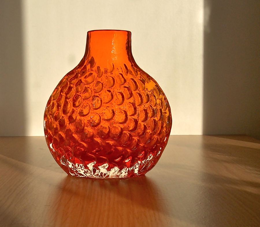
These smart, chunky vases are by Whitefriars and all date from the early 1970s. Not only do the vases have the intensity of that wonderful deep orange colour, they also have such nice surface textures. The square vase has a raised spiral decoration, known as Greek Key, the bulb-shaped vase (known as the Onion vase, I think) is covered in large impressed blobs, and the taller vase has a lovely tactile 'tree bark' surface. The orange colour is known as Tangerine by Whitefriars collectors – and, not surprisingly, there are quite a few of those. There's an excellent collectors site with lots of information on Whitefriars glass, here: Whitefriars collectors site

I can see why Whitefriars glass is as popular as it is. If these three small vases look so good displayed together, you can imagine what impact a couple of large pieces would have.

P.S. If, because of my title, you accidentally arrived here expecting to find something on Tangerine Dream, the mighty fine German electronic music group, my apologies. You could try here: Tangerine Dream official website