Hello. We like to collect well-designed vintage pottery (and lots of other stuff) from the 1950s,
'60s and '70s. Here are some pictures and info of a selection of the things we've found.

Showing posts with label John Clappison. Show all posts

Wednesday, 13 February 2013

Groovy. Westminster vases 1960 1961


Here are a couple of vases by Hornsea pottery that I've always found quite pleasing to the eye. The range is Westminster (I don't know why) and it was produced in 1960 or 1961.

Hornsea seem to have perfected the technique of vertical grooving filled with colour, they used it on the beautiful Summit range, the Summertime range, and others. On this example the grooves are tapered and are very fine by the time they reach the bottom. As far as I know, there were only two sizes of Westminster vases made and only three colours were used. The colours are similar to some of those used on the Summit range so this range displays well with Summit. The pointed arch-shape at the top of the grooves is an elegant feature and the gently flared top is a nice touch too.

One of my favourites.

Hornsea Summit 1960 - 1965

Friday, 4 January 2013

Looking after the pennies, 1950s style.


If, like me, you're a bit low on funds at this time of year, you may have made a resolution to do some saving up. And to save up, you'll be needing a suitable piggy bank. Luckily for me I have not one but two and they're a couple of beauties.

I can think of no finer way to store-up the surplus small change than with one of these Hornsea Pottery penny piggy banks. Designed in the mid 1950s, almost certainly by John Clappison, they are in a simplified, stylised shape with short legs and long snouts. I particularly like the cylinder-shaped bodies that end in a curly tail.

You can see some more good-looking pottery piggy banks here: The Piggy bank page

Friday, 16 March 2012

Bird cruet. John Clappison. 1966.


What could be nicer than having breakfast with this delightful salt and pepper set sitting on the table? The intense blue colour, the stylish, modern shape, and the graphic illustrated bird design – it's a real joy.

This is the work of designer John Clappison and believe-it-or-not, this bird cruet set dates from 1966. The set is from a range produced at the time by Hornsea pottery. Other animal cruets in the range are owls, cats and fish. One of the birds (the salt) has a single hole at the front of its beak, the other (the pepper) has three small holes. The sets were all printed in black onto either brown, green or blue backgrounds. I like the blue.

Some time ago, I did a blog-post on the owl cruets from this range. Remember this: Owl cruets.

The more I look at these pieces, the more I can't help thinking that, in a way, the work has a Scandinavian feel to it. I wasn't surprised, therefore, to learn that John Clappison had been to Sweden in 1962. He visited the Gustavberg factory where he met Stig Lindberg at his studio. John also met Gunnar Nylund during this period. In earlier years, John Clappison had met Nils Thorsson at the Royal Copenhagen factory. John had also discovered the work of Nils Kähler at Kähler Keramic. John says that Kähler's work had a big influence on him at the time.

Who knows? perhaps some of that Scandinavian freedom of expression was in the back of the mind of John Clappison when he produced these little gems.

Saturday, 18 February 2012

Hornsea Summertime with a nod to Kitschenpink


As a quick follow-on to the last blogpost on the Hornsea Summit range, and in response to a comment from Teena at Kitschenpink, here are some photos of the Summertime range by Hornsea Pottery. The range was produced between 1962 and 1964.

The range does have many similarities to the Summit range. Like Summit, the Summertime range has white bodies with fluted stripes of colour inlay but on the Summertime range, the stripes are slightly narrower and closer together. The Summertime range also features the addition of co-ordinating plastic lids, which add a nice splash of colour.

So, big thanks to Teena for her comments on Summertime and for giving me the inspiration to do this blogpost.

Wednesday, 8 February 2012

Hornsea Summit for La momes


A quick blogpost to answer a question from La momes Old fashioned

This fluted striped tableware with inlay colour is called Summit. It was made by Hornsea Pottery, England between 1960 and 1965. Some time ago I did a blogpost on the Crafty Cruet. I promised then to do a blogpost on Summit, which I will do soon. You can see an example of Summit at the Victoria and Albert Museum in London, here: Summit at the V&A

Friday, 3 February 2012

True 1950s style. Elegance by name, elegant by...


If ever a range of pottery typified the design style of the 1950s, to me, this would be it.

Designed in the mid 1950s by a young John Clappison for Hornsea Pottery, this is Elegance. The range was in production between 1955 and 1959. The asymmetrical shapes incorporate deep curves. The outers are decorated with clean white unglazed stripes against a glossy black background. The interiors and details are in yellow, sometimes in golden yellow, sometimes in paler lemon yellow. Shown here (middle picture) is a smart salt and pepper set with a tall tapering form, and a vase (bottom picture) which has a hole on its flat back side to allow for hanging on a wall.

There's a fine example from the Elegance range in the collection of the V&A museum, London. You can see it here: Elegance vase

If, like me, you have a fondness for mid-century design, you'll probably agree that this range could be truly described as Elegance by name, and elegant by nature.

Wednesday, 21 September 2011

Hornsea slipware vases. Smart zig-zags from 1963


Elegant shapes, cool pastel colours, and simple zig-zag designs combine to make these vases so distinctive - and so stylish.

They were all made in 1963. Known as Slipware vases, they were made by Hornsea Pottery. Each has a painted grey band which is hand-decorated with those fabulous zig-zags in white slip clay. It's nice to display a single vase on its own but they look even nicer when displayed in groups. I can't decide if groups of mixed colours look better or groups of vases all in the same colour. I suppose it would depend on the decor of the room. Either way, I love these vases. In my opinion, this Slipware range is one of the best looking designs ever to come out of Hornsea Pottery.

Saturday, 11 June 2011

Hornsea Jungle mugs. They were news in the 1970s.


Screen printed in black onto coloured backgrounds, the illustrations for these mugs have strips of newspaper cuttings incorporated into the bodies of the animals.

Known as Jungle Mugs, they were made by Hornsea Pottery in the late 1970s. The stylish illustrations have a sophisticated, highly graphic feel and yet they have subtle touches of humour. I love those blank expressionless faces. The range consisted of six different wild animals. As well as the tiger, hippo and elephant, there were also mugs depicting a lion, a toucan and an owl.

I don't know about you but I think they're just wild.

Wednesday, 18 May 2011

I know what you mean, mate.

 
I had to chuckle when I read this on Rob's blog this morning: Rob's Robert Jefferson storage jars
Although we shouldn't laugh really. Completism is an incurable affliction that can strike anyone.
Seeing that wonderful collection of Robert Jefferson spice jars, reminded me of how easy it is to be drawn into the need to find the whole set.
And spice jars seem to be the perfect bait to tempt collectors in. You start by finding a nice looking spice jar, then you find another, next you're trying to find how many were made and before you know it, you're hooked.
I got caught on the spice trail too. My quest was for these Hornsea Pottery spice jars from 1965, 1966. The retro designs are screen printed in black onto white jars. The jars have nicely turned wooden lids.
I still have the spice jars but decided that I had to give up collecting them when I discovered they were made in at least two different sizes and in four different colours – white, brown, blue and green. I mean, be reasonable, enough is enough.
So, a good excuse to show some stylish retro spice jars. But also a gentle warning to others of the hidden dangers of the vintage spice jar.


Wednesday, 11 May 2011

Hornsea Pottery Studio Craft, 1960. Who needs colour?


Who needs colour?

Not if you have shape and texture like this.

I like how the shapes are nicely varied. There's a tall torpedo-shaped fluted vase, a Y-shaped jardiniere and a squat-shaped bowl. Two of the pots have a wonderful texture of carefully arranged raised dots or pimples (named as White Bud). The silky transparent glaze leaves only the colour of earthenware clay.
 
These elegant and subtle vases are by Hornsea Pottery and they were designed by John Clappison. The name of the range is Studio Craft, Home Decor and they date from 1959 - 1962.

My favourite is the small bowl. It was made in 1960 but it's another one of those well-designed items that looks as modern today as the day it was made.

Monday, 9 May 2011

So, what's in the boxes?


Some time ago I did a post on Hornsea packaging. You can see it here Hornsea packaging

I said I'd let you know what was in the boxes. Well, today's the day. And the answer is owls.

Owl salt and pepper sets to be precise. They were made in 1966 by Hornsea Pottery and are designed by John Clappison. I think the graphics on the owl illustrations are superb, I also like the simplified owl shape of the pots. The cruets were made in three colour schemes – there's also a brown-bodied version. As well as these owl cruets, there are also similar ones in the form of birds, fish and cats.

Lovely examples of 1960s retro style, made even better by being in original boxes.


Friday, 25 March 2011

It's Springtime Hornsea style


At last. It's nearly Spring.

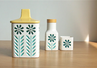
And this is Springtime by Hornsea Pottery. From 1964 to 1965, this cheerful design is by John Clappison. Today, I think it looks wonderfully retro and so typical of the style of the mid 1960s. Simple flower illustrations are coloured with dark-green, orange and light-blue inlay. The square shaped bodies look smart and well proportioned. This kitchen range had storage jars, cruets, preserve pots as well as various items of tableware.

Springtime items do occasionally crop up on eBay. The storage jars and preserve pots seem to be more common but I suspect the mug or beaker is getting quite rare now.

Forty-odd  years old - and would still brighten up any kitchen shelf.

Tuesday, 22 March 2011

Impressed by Hornsea Imprest

Here we go, then. Potshot number one.

Let's start with some John Clappison lovlieness. To me, it's got the lot. Great colour combination, contrasting surface texture, clean bold shapes, and simple but beautiful decoration.

This is Hornsea Pottery. The range is Imprest, designed by John Clappison (who's work will feature quite frequently on Potshots) and produced 1964-1965. There are four different patterns in the range: Square and Circle (shown in the large picture), Fish-Eye (the two vases), Eye, and Bamboo.

To me, these bold vintage ceramics have a strong mid-century feel. And, as you'll gather, I'm impressed.