Hello. We like to collect well-designed vintage pottery (and lots of other stuff) from the 1950s,
'60s and '70s. Here are some pictures and info of a selection of the things we've found.

Showing posts with label Mid Century design. Show all posts

Wednesday, 19 November 2014

Twin Bird, Japan. Retro home bar accessories. 1970s


If you're lucky enough to have a home bar, and your home bar is styled in a retro theme, then here's the very thing for you.

A fabulously retro water jug and matching ice bucket. The metal jug and ice bucket have semi-transparent lids, plastic liners for double insulation and are in a bright lime green colour. The ice bucket is marked Twin Bird on the base. Probably made in Japan in the 1970s, these two eye-catching home bar accessories would look great next to a bowl of lemons and limes.

In fact, they look so good, I'm off to build my own bar right now. Cheers.

PS We've opened a little shop on Etsy. You can see it here: Potshots on Etsy 

Tuesday, 28 October 2014

Frozen Daiquiri, anyone?


Wow. They really knew how to illustrate books in 1967. Well, John Alstrop and Eric Hill did anyway.

Published by Determined Productions Inc, San Francisco, in 1967, Booze is an amazing little illustrated book of some fifty-odd cocktail recipes. I've no way of knowing if the two designer/illustrators sampled any (or all!) of the cocktails before putting their colourful pens to paper, but they certainly didn't hold back. The pages are filled with vibrant and humorous images in a wonderfully typical 1960s psychedelic style.

It's a lovely little book. And goes quite well with a quirky little drinks tray we found recently which probably dates from the same era.

Cheers.


Saturday, 22 June 2013

Mysterious girl. Stylish 1950s bust of a girl.


Here's something I found recently about which, I have to admit, I know nothing at all.

This beautiful head and shoulders of a girl is made from that sort of chalky pottery that easily chips. She's about nine inches high and is very much in the 1950s style. There's an unreadable signature on the back with the wording Bust No. 4. I wonder if there are more in the same style?

I like the stylised, exaggerated shape and the curved lines. The colours work well too.

A mystery she may be but I'll have to make room to display her somewhere.

Wednesday, 19 June 2013

Matching lamp base for Poole Freeform vase


It seems like ages ago when I did a blogpost on a Poole Freeform vase from the 1950s. Remember this:  Poole Freeform vase. 

Here is a matching item that I have had displayed with the vase. This item is actually a lamp base but I think it looks more elegant displayed without any of the fittings. The design is hand-painted, I think by Gwen Haskins, and I have an idea that it dates from the late 1950s or early 1960s.


Saturday, 22 December 2012

Sweet simplicity in stainless steel.


Who was it that said 'Less is more'?

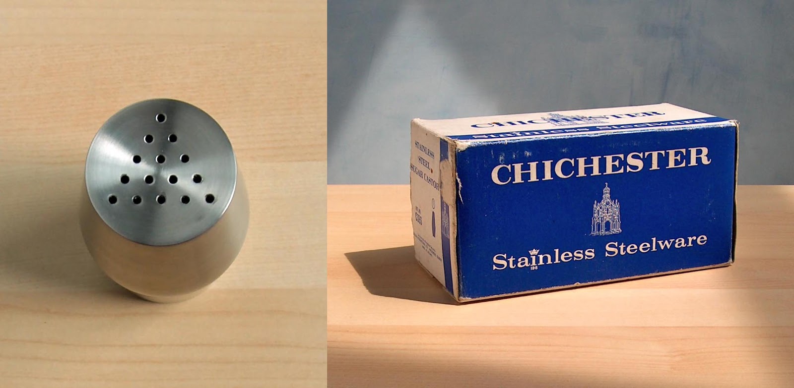
Do you find that sometimes, when you see and an object, it looks and feels just right? It may not be an expensive object – like this humble sugar shaker – but somehow you get the feeling that the designer got it spot on.

I do. And I did, when I found this stainless steel kitchen accessory in a local charity shop recently.

I suspect that simplicity is the key. And I imagine that it's not easy for a designer to get that just right: keeping to a perfectly symmetrical form, resisting the urge to add any decoration and carefully considering every small detail right down to the arrangement of the holes in the top. Simple but not easy.

As for the sugar shaker itself, all I know of it is that it was made in Britain by Chichester, I would guess around the late 1960s or early 1970s.

Sweet.

Sunday, 8 April 2012

Barovier & Toso Murano glass. Gold and silver to Italy


If there were Olympic medals for glitzy glass, Italy would win gold and silver with these flashy glass creations.

These eye-catching glass forms are by Italian makers, Barovier and Toso. And when it comes to making glass, they've been at it a good while: Barovier founded in 1295.

The large vase in the top picture is a wonderful deep red colour and has gold leaf crackle inclusions. The smaller bowl again is in red but this example has silver inclusions. I have an idea they date from the 1950s. I particularly like the flowing lines and wavy edges.

Barovier and Toso are still going strong today and have a smart website here: Barovier & Toso

Sunday, 1 April 2012

Hornsea Impact vases 1964 1965. Part two.


It was almost a year ago when I did a blogpost on Hornsea Impact vases.

Remember this: Hornsea Impact vases

The vases shown back in April 2011 were all based on a square shaped body. At the time, I promised to show the other versions from the range – the round shaped bodies. Well, sorry for the wait but here they are.

The vases are from 1964 and 1965 and have a raised graphic decoration and coloured narrow fluting. I hope you agree that it was worth the wait.

Saturday, 24 March 2012

Phono Boy. Fantastic plastic by Mario Bellini.


How cool is that? Imagine walking round in 1968 with your favourite poptastic hit record playing on this little beauty.

This is the Grundig Phono Boy portable record player, designed by Mario Bellini in 1968. Love the shape, love the colour. The player is designed to play a 7 inch 45RPM vinyl record which slots neatly in at the top – so I suppose you could say this is the 1960s version of the iPod.

I've seen pictures of the Phono Boy in bright green and bright red, and also in White. And, to me, the Phono Boy certainly qualifies as a fine example of fantastic plastic.

There's a good source of technical information on the Phono Boy here: John's Radio Web

Friday, 16 March 2012

Bird cruet. John Clappison. 1966.


What could be nicer than having breakfast with this delightful salt and pepper set sitting on the table? The intense blue colour, the stylish, modern shape, and the graphic illustrated bird design – it's a real joy.

This is the work of designer John Clappison and believe-it-or-not, this bird cruet set dates from 1966. The set is from a range produced at the time by Hornsea pottery. Other animal cruets in the range are owls, cats and fish. One of the birds (the salt) has a single hole at the front of its beak, the other (the pepper) has three small holes. The sets were all printed in black onto either brown, green or blue backgrounds. I like the blue.

Some time ago, I did a blog-post on the owl cruets from this range. Remember this: Owl cruets.

The more I look at these pieces, the more I can't help thinking that, in a way, the work has a Scandinavian feel to it. I wasn't surprised, therefore, to learn that John Clappison had been to Sweden in 1962. He visited the Gustavberg factory where he met Stig Lindberg at his studio. John also met Gunnar Nylund during this period. In earlier years, John Clappison had met Nils Thorsson at the Royal Copenhagen factory. John had also discovered the work of Nils Kähler at Kähler Keramic. John says that Kähler's work had a big influence on him at the time.

Who knows? perhaps some of that Scandinavian freedom of expression was in the back of the mind of John Clappison when he produced these little gems.

Thursday, 8 March 2012

Teak, metal, modern design, it must be Danish.


There's something very pleasing about items made from teak and black metal, it's a common combination of materials in mid-century modern design. So I was very pleased to add this small 3-legged candle holder to the Potshots collection this week.

I'm afraid that I don't know a lot about it, though. I would guess it is from the late 1950s or early 1960s. I don't know who made it or where it comes from but would think it's likely to be Danish. Although the candle holder does not have a maker's mark, it has Denmark written all over it. The simple and elegant design, the modern shape and the use of such materials, all indicate that it is probably from Denmark. If you do know for sure, I'd love to hear from you.

The tops of the candle holders are a bit blackened now but they look to be in a brass coloured metal. A nice object. Would look great with some very tall candles.

Wednesday, 8 February 2012

Hornsea Summit for La momes


A quick blogpost to answer a question from La momes Old fashioned

This fluted striped tableware with inlay colour is called Summit. It was made by Hornsea Pottery, England between 1960 and 1965. Some time ago I did a blogpost on the Crafty Cruet. I promised then to do a blogpost on Summit, which I will do soon. You can see an example of Summit at the Victoria and Albert Museum in London, here: Summit at the V&A

Friday, 3 February 2012

True 1950s style. Elegance by name, elegant by...


If ever a range of pottery typified the design style of the 1950s, to me, this would be it.

Designed in the mid 1950s by a young John Clappison for Hornsea Pottery, this is Elegance. The range was in production between 1955 and 1959. The asymmetrical shapes incorporate deep curves. The outers are decorated with clean white unglazed stripes against a glossy black background. The interiors and details are in yellow, sometimes in golden yellow, sometimes in paler lemon yellow. Shown here (middle picture) is a smart salt and pepper set with a tall tapering form, and a vase (bottom picture) which has a hole on its flat back side to allow for hanging on a wall.

There's a fine example from the Elegance range in the collection of the V&A museum, London. You can see it here: Elegance vase

If, like me, you have a fondness for mid-century design, you'll probably agree that this range could be truly described as Elegance by name, and elegant by nature.

Thursday, 8 December 2011

Vintage Quality Street sweet tin. Happy retro Christmas.


In summer, I visited a local second-hand sale. After an hour searching through all the stalls, the only thing I bought was an old tin filled with buttons. The buttons cost just £1.00 but it was the tin that had caught my eye. Now December is here, I thought it would be good time to show it on the blogsite.

The tin is an old sweet tin, most likely from the 1950s or early 1960s. Produced for Mackintosh's Quality Street (still going strong today), the tin is decorated with some excellent vintage graphics. The colour combinations are perhaps not the most obvious, mid-blue, pale-yellow, pink and black but they somehow work together and they certainly evoke the era. A nice detail is the row of Christmas trees round the rim of the lid – remove the lid and another layer is revealed.

A nice tin. Sweet and quality, you could say.

Monday, 10 October 2011

Carn pottery. Growing up fast.


Troika pottery, from Cornwall, has had a spectacular rise to fame over the last decade or so. It's grown to become one of the most collectable, sought-after ranges of UK studio pottery. I must admit, I'm a big fan myself – as you can see here Troika on Potshots and here more Troika.

But Troika has a sort of little brother. Not really a poor relation, and not a poor man's Troika by any means. Carn pottery, also from Cornwall (Penzance), is growing up fast. It's not surprising that Carn pottery is becoming increasingly popular. there are some very nice items in the range.

Subdued colour schemes, textured surfaces and panels of abstract design all combine to give a sense that these attractive studio pots have a real hand-made, hand-crafted quality.

As Carn pottery is still quite reasonably priced, it may be a good time to pick up a couple of carefully chosen pieces. Who knows, one day it may enjoy some of the fame that Troika has had.

The vase shown here probably dates from the early 1970s.

Monday, 26 September 2011

Mdina glass vases


I seem to have strayed off into glass recently, so I thought I'd continue the theme with this quick blogpost on a couple of Mdina vases.

I occasionally come across Mdina glass on my travels, some of it is little bit ordinary but some of it looks quite good. I like the vases with simple shapes best. I think the flat tops on the necks of these two vases are a nice touch. The green and sand colour scheme seems to be very typical but I also like the more subtle, simplified colour scheme of the larger vase.

I have some more Mdina vases and hope to do a blogpost on them sometime soon.

Mdina glass was produced in Malts. I would say these vases date from the mid-1970s.